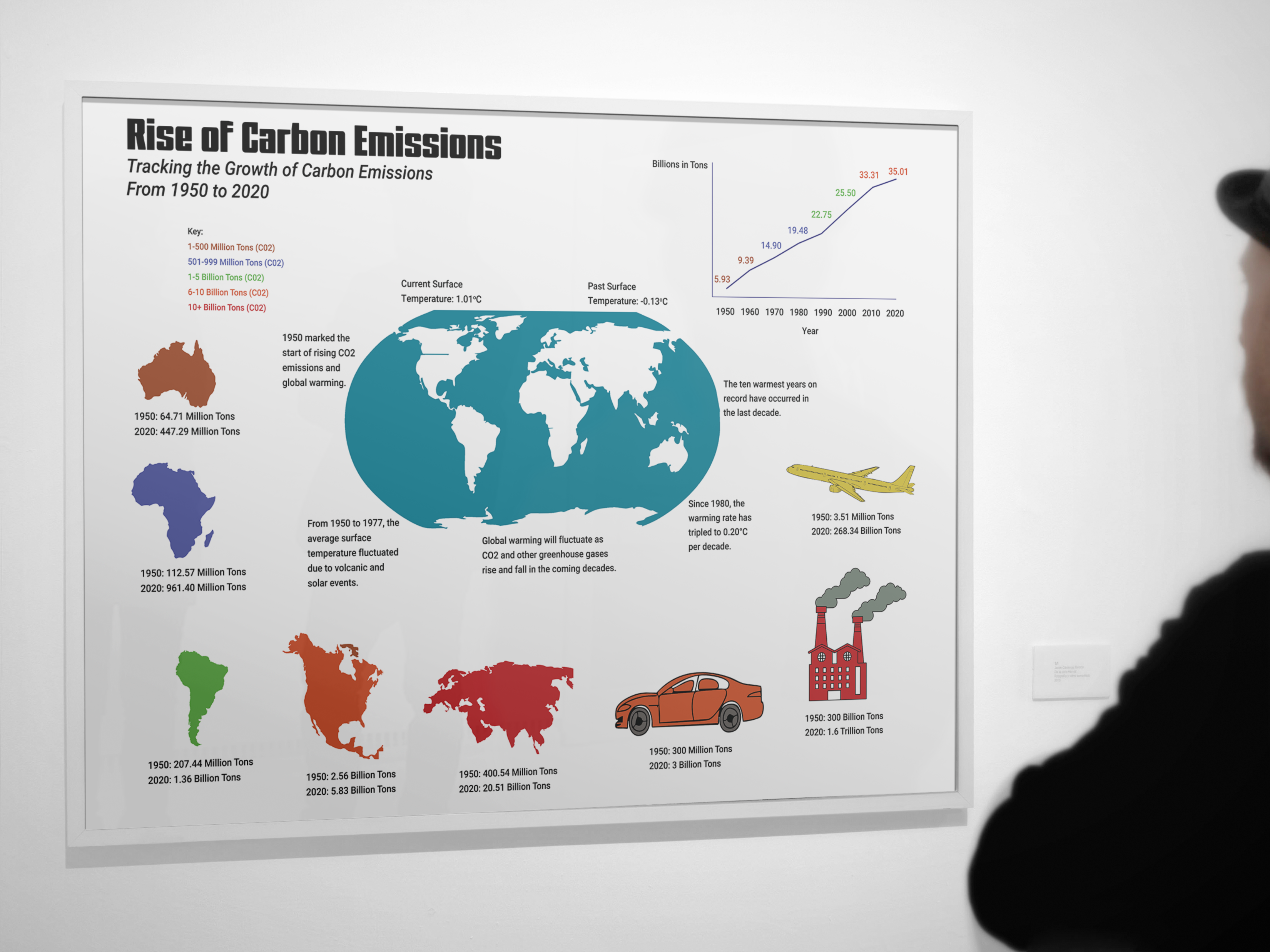
Infographic
Prior to anything, I decided that C02 emissions worldwide would be my topic for this project. Creating an infographic that presents various data through color, text, and objects.
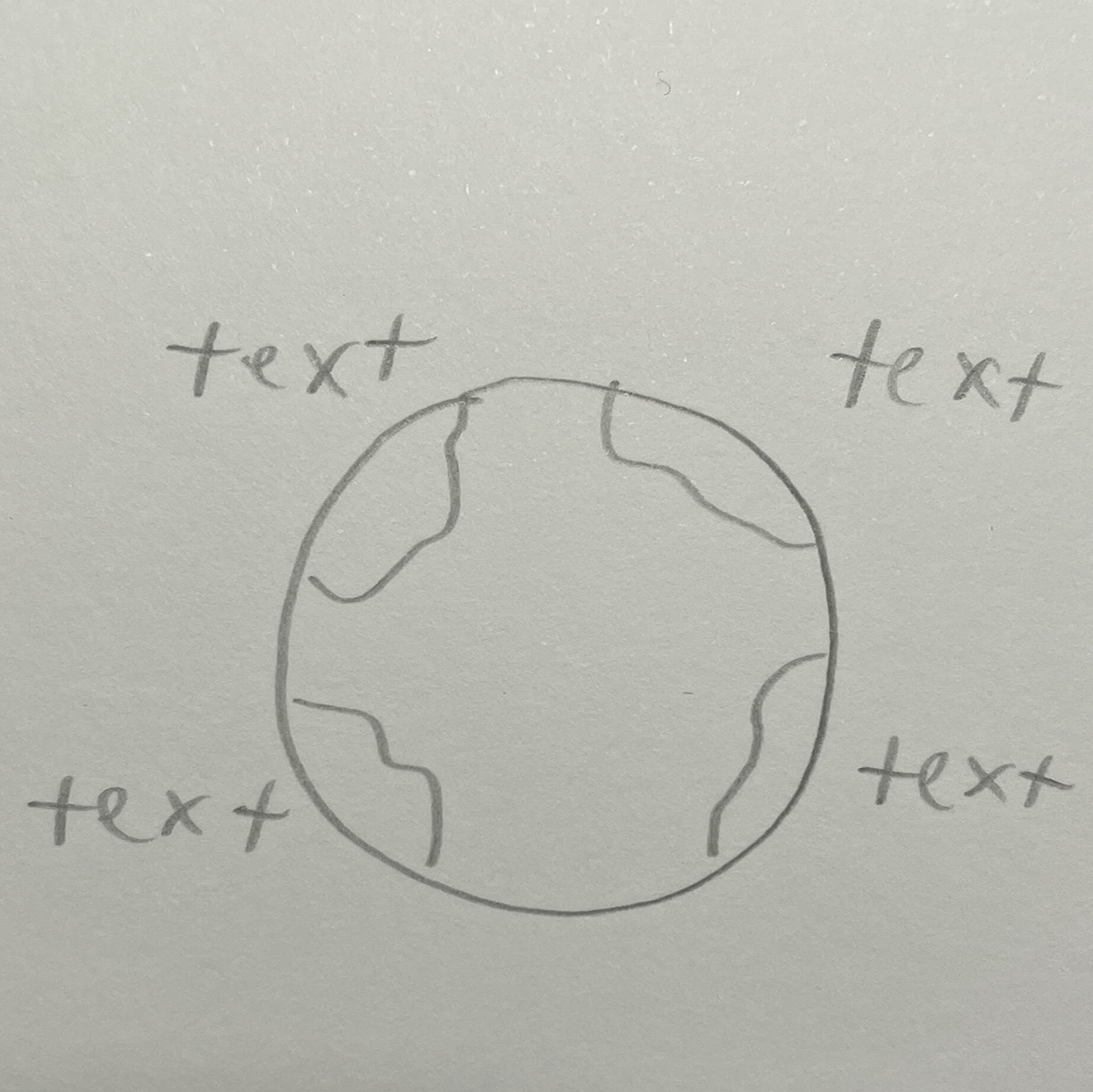

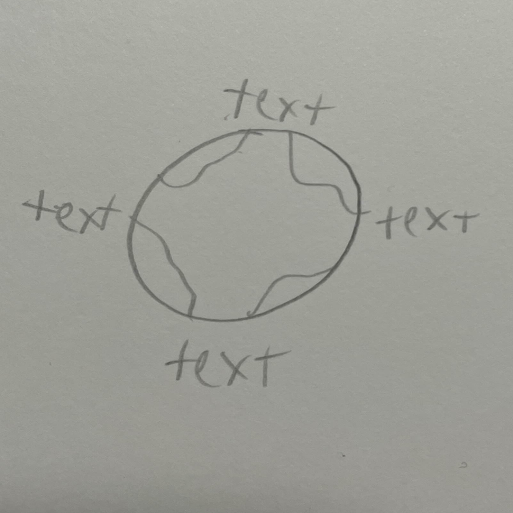
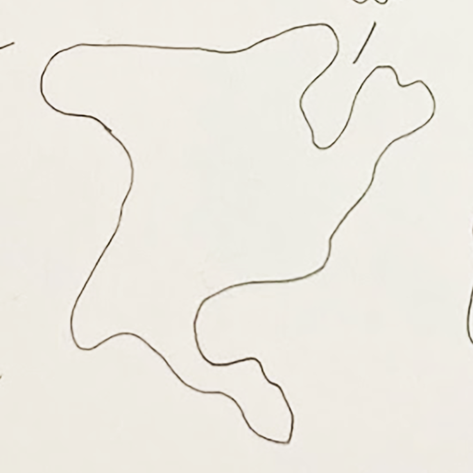
Sketches
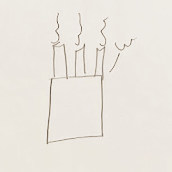
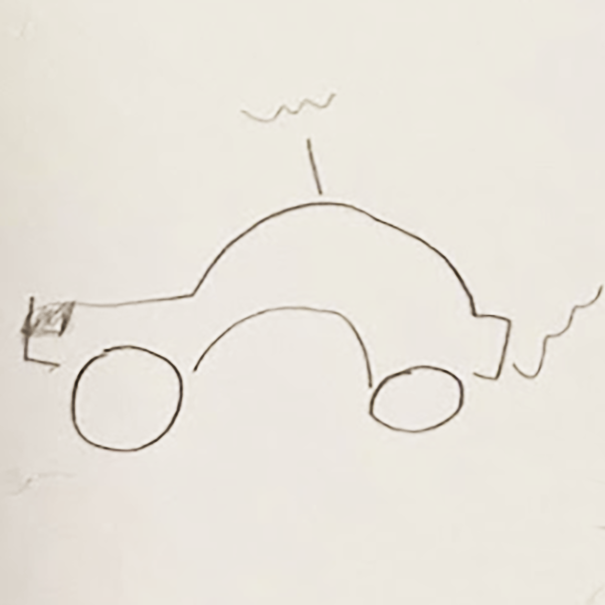
The first three sketches on the first row show the earth with text placed all around it. The idea being that each text is a fact about C02 emissions.
The second row of sketches contain a few symbols that would later be fully developed with more detail. Such as a car, factory, continent, etc.

Colors
There are plenty of colors which are used within the infographic. Each color adds to the overall project. For parts of the infographic, the cooler colors were used to show a low emission of C02. The warmer colors were used as a way to show large C02 emissions.
_
Typography
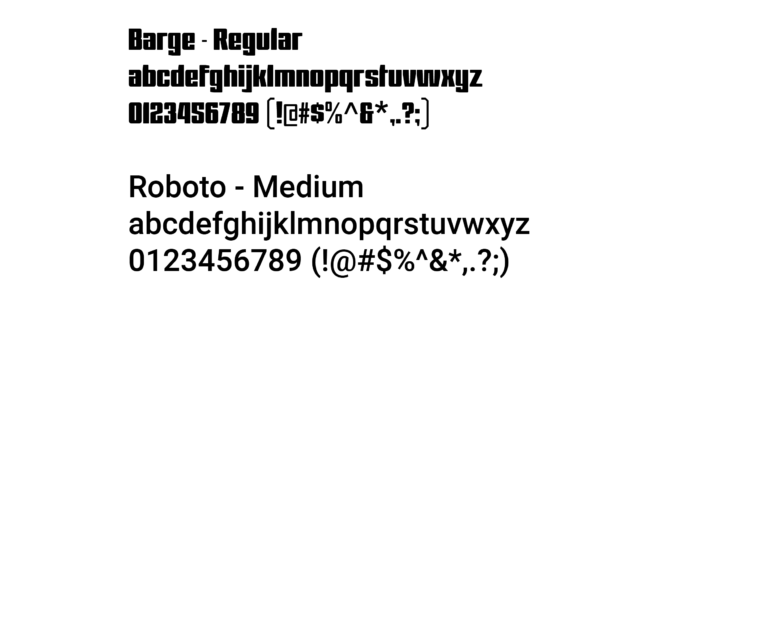
Barge-Regular was used only for the title to have it be unique and stand out. Wanting to catch the viewer’s eye.
Roboto was used for the rest of the text within the infographic. The subtitle is the only instance of italics used in the project.
Digital Drafts
This early iteration of the infographic served as a basis for all other drafts. Creating the basic shapes and parts of the infographic that would later be developed further with more detail. Some text was inconsistent, and certain text had too much. These problems would be addressed in later iterations.
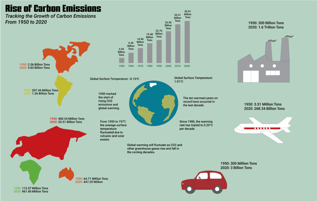
This iteration is a bit more refined with the placement of the infographic parts, text, and color usage. Giving the background a color. Any inconsistent text was fixed here as well as text length. Most of the symbols within the infographic were made larger for easier viewing. The graph at the top was changed out for a bar graph instead of a timeline. Still, there was still room to improve the overall infographic.
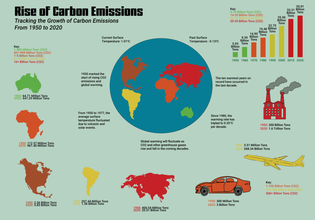
This iteration served a second to final basis for what the last infographic would become. The infographic was given color in order to view the data easier. As well as placing keys throughout the data for each associated part. The globe was changed but still looked awkward. From here, it was all about changing certain details. Such as what really needs color, all info text being the same typeface, etc.
Final Infogrpahic
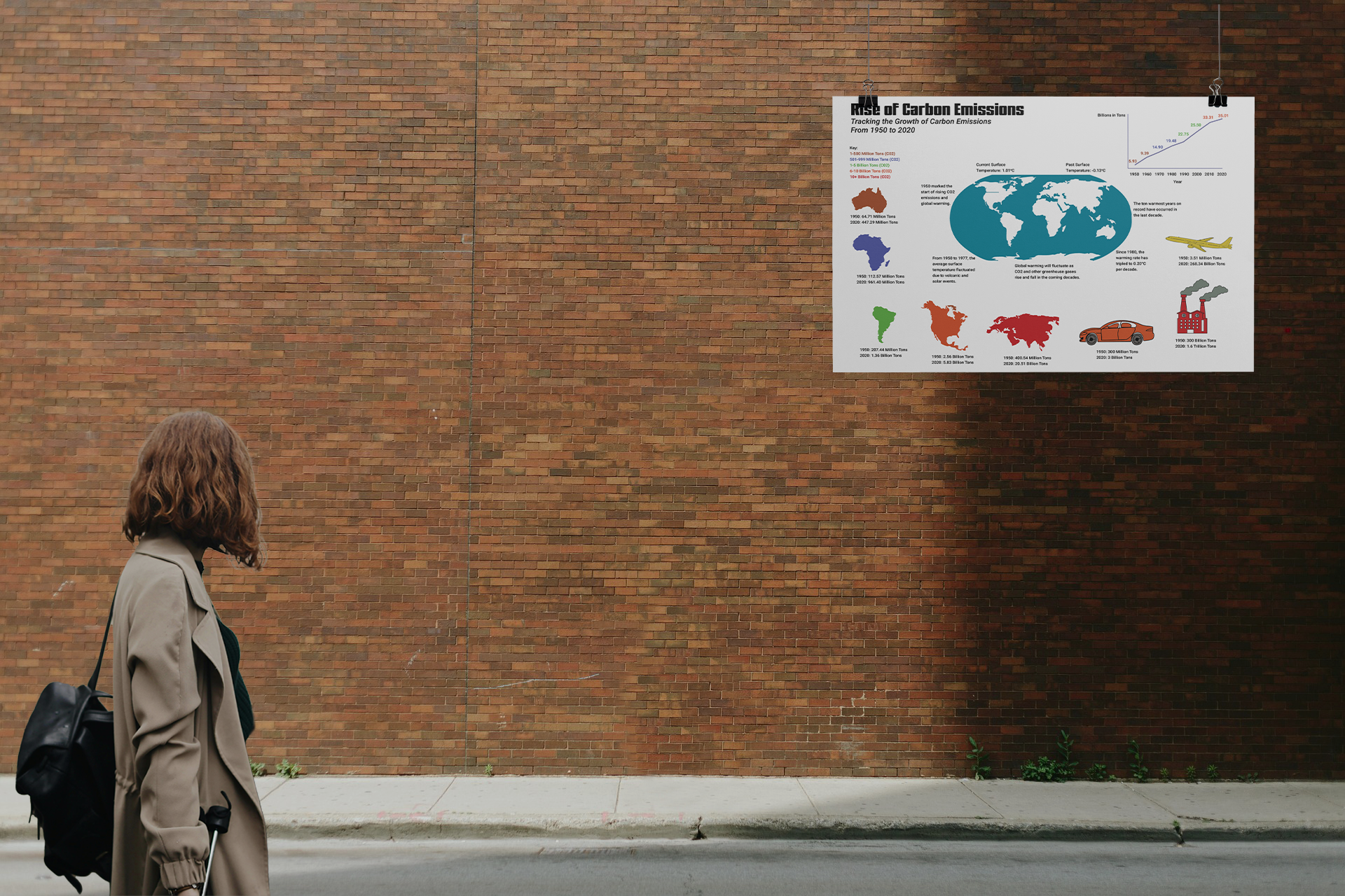
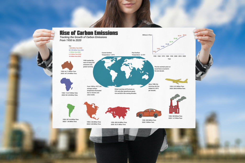
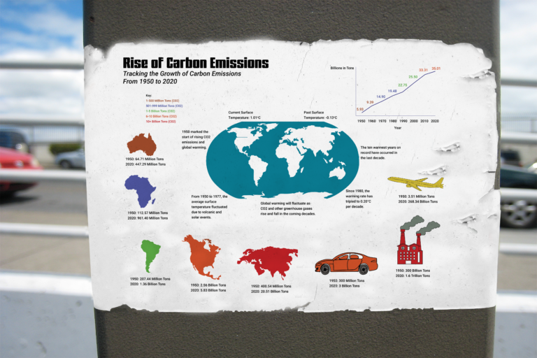
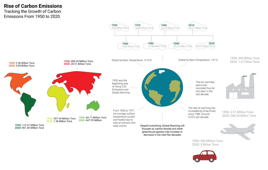
This is the final iteration of my infographic. Going through plenty of changes until the end. The bar graph was swapped out for a line graph that shows the data more clearly. A few colors were moved and changed in order to make reading data easier as well as making it more visually readable.

Environmental Contact

