Triptych Poster
My intent with the triptych poster is to make the viewer realize how too much technology can be unhealthy for you through the usage of visuals and typography to better convey the message.
Sketches
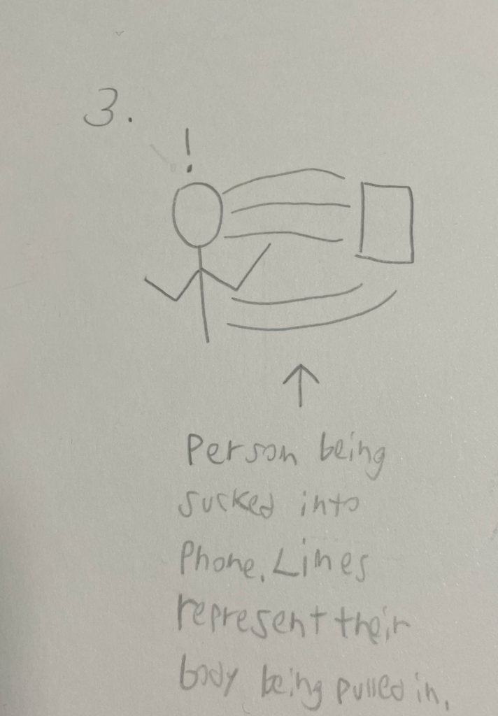
The first sketch depicts a person distracted by their phone, walking into traffic, symbolizing technology’s dangers. The second shows a hand emerging from a pile of old electronics, representing the feeling of being overwhelmed by technology. The third illustrates someone being sucked into their phone, highlighting how technology consumes our attention.
Colors
The triptych poster only contains one color. However, it was the most optimal color to pick for multiple reasons. Due to the dark lighting in each image across the triptych, it made for great contrast. Plus, it made each text clear and visible to read.
Typography
Agenda One – Extra Bold was used and picked specifically for the main title of each poster. Wanting it to be catching and large. Which is what this font does.
For the short body text, I simply kept the font the same as the title, just simply lowered the size of the bold. Not taking away from the title while also making the text large enough to be read.
For the call-to-action, I went with Almaq – Refined. This font was readable even at a small size, considering the call-to-action text, this was perfect.
Digital Drafts
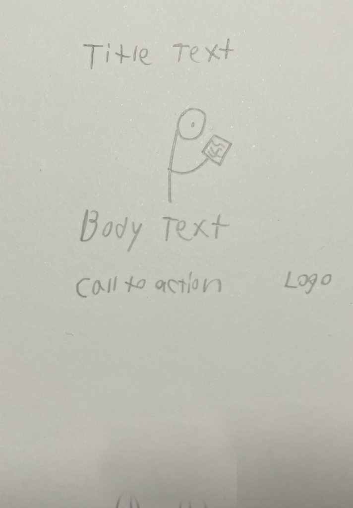
This is one of the earliest iterations of the triptych poster that I created. It didn’t work for multiple reasons and was changed entirely in later iterations. This was due to many factors such as images used, varying color choice, margins, and typography.
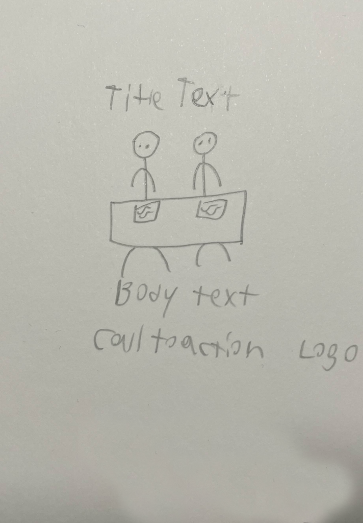
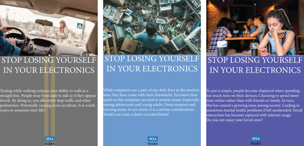
This is one iteration created during the middle of the process. Getting more things to be aligned with some aspects still contrasting. However, there was still much more room to improve. Such as the layout of the text, margins, and finding a good image for the middle piece.
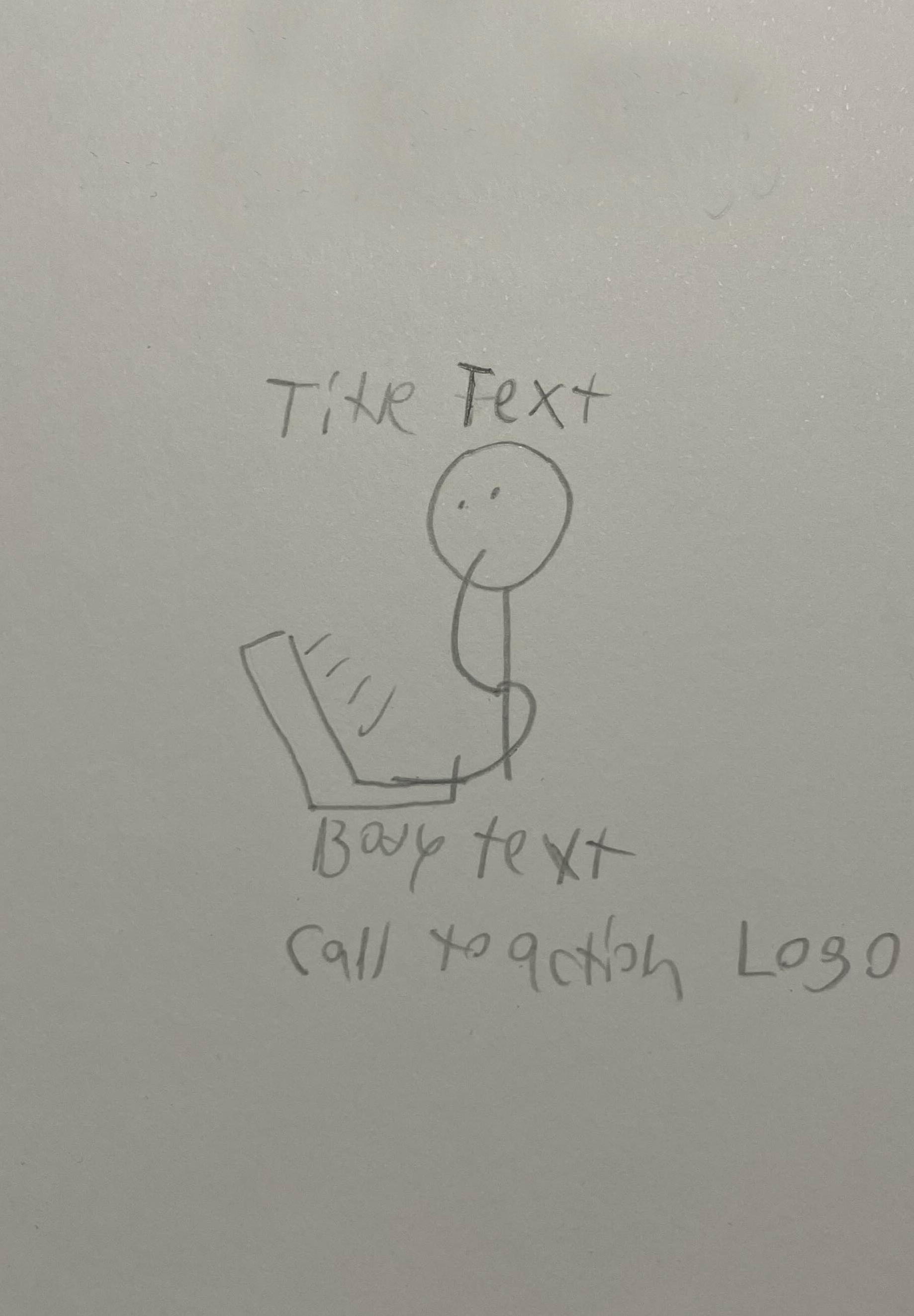
This iteration was created near the end of the process. However, it is still much different than the final triptych design. The middle image was still not what I wanted, needing to replace it. The body text also needed to be shortened and changed in terms of alignment.
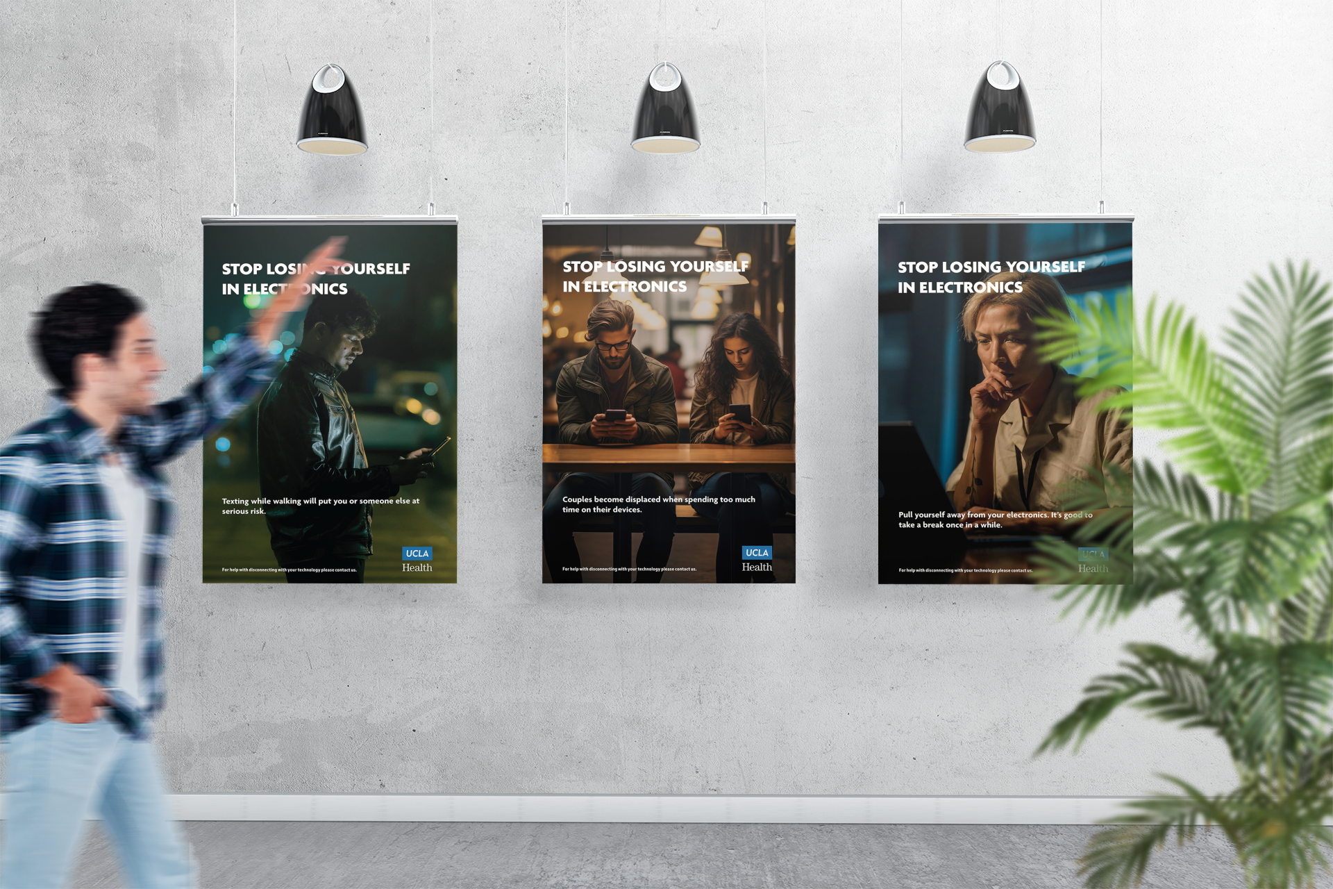
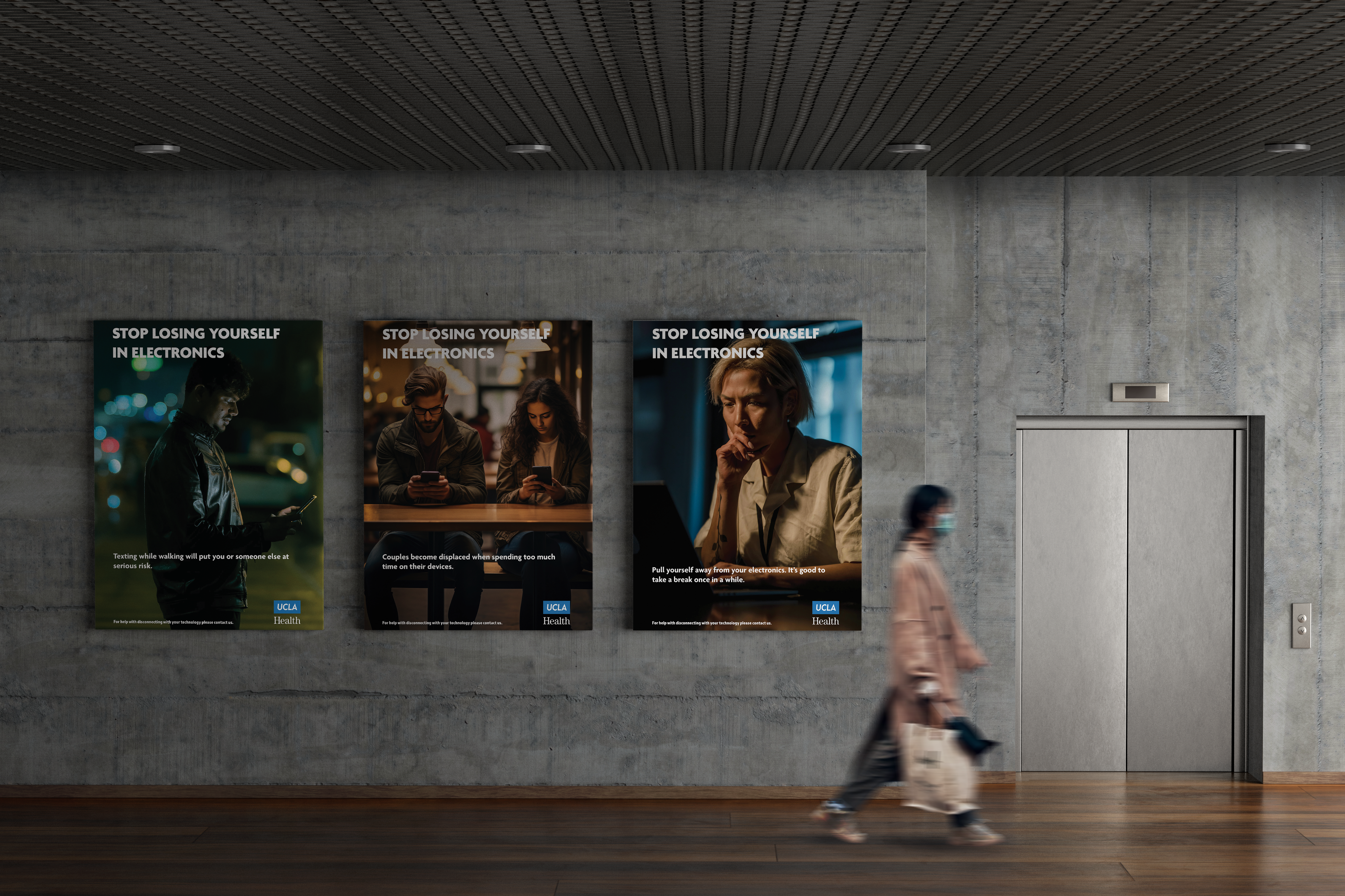
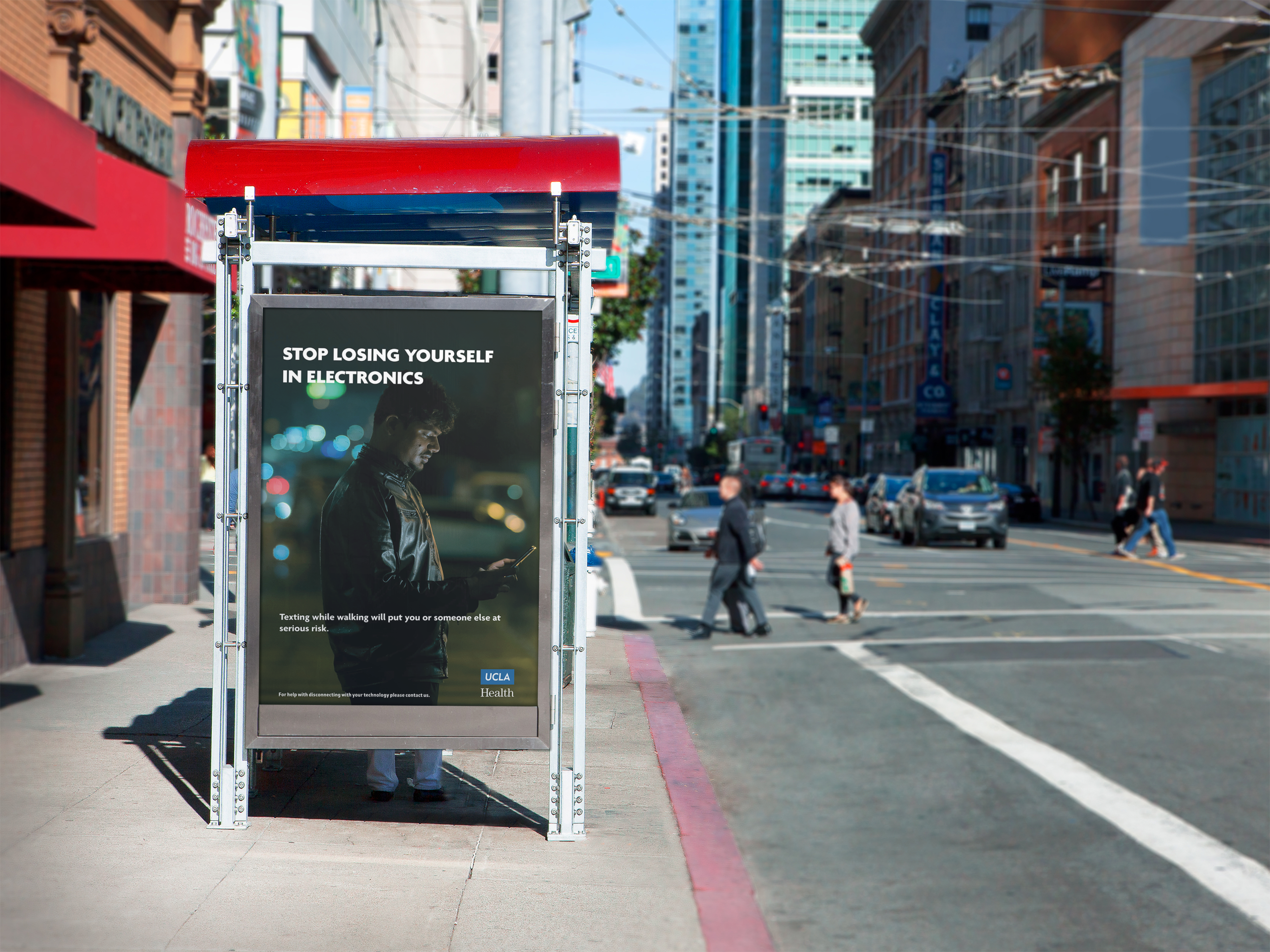
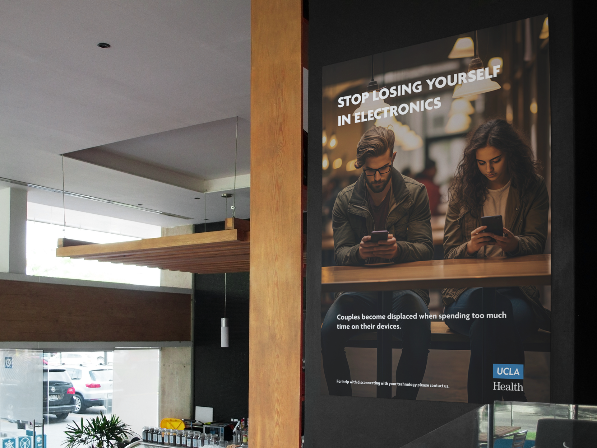
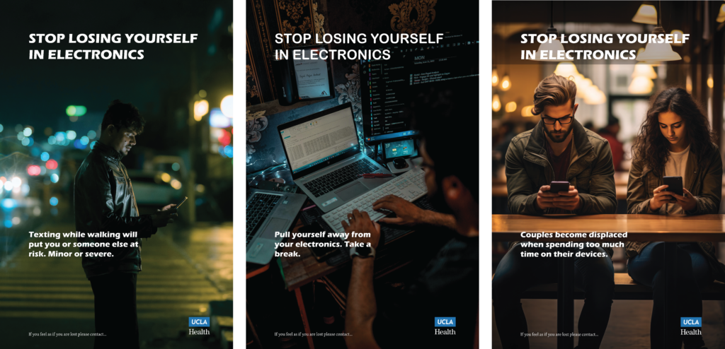
Final Triptych Poster
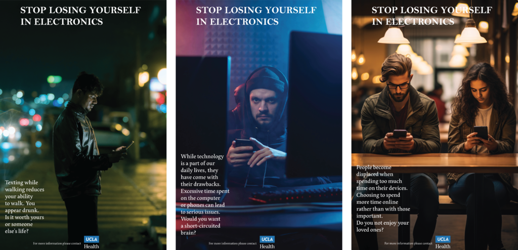
This is the final iteration of my triptych poster. Taking into account each change from each iteration, in the end, it all accumulated to what we see here. Having a catching title, a short and sweet body sentence, along with a call to action at the bottom. The second and third images were moved around to better complement the overall triptych. The third image was the perfect image that I was looking for, replacing the last image in the previous iterations.

Environmental Contact