Magazine
My goal with this project was to create a two-page spread magazine. Choosing the topic of health for the article. Creating a small magazine article one would see or read when looking through a real magazine.
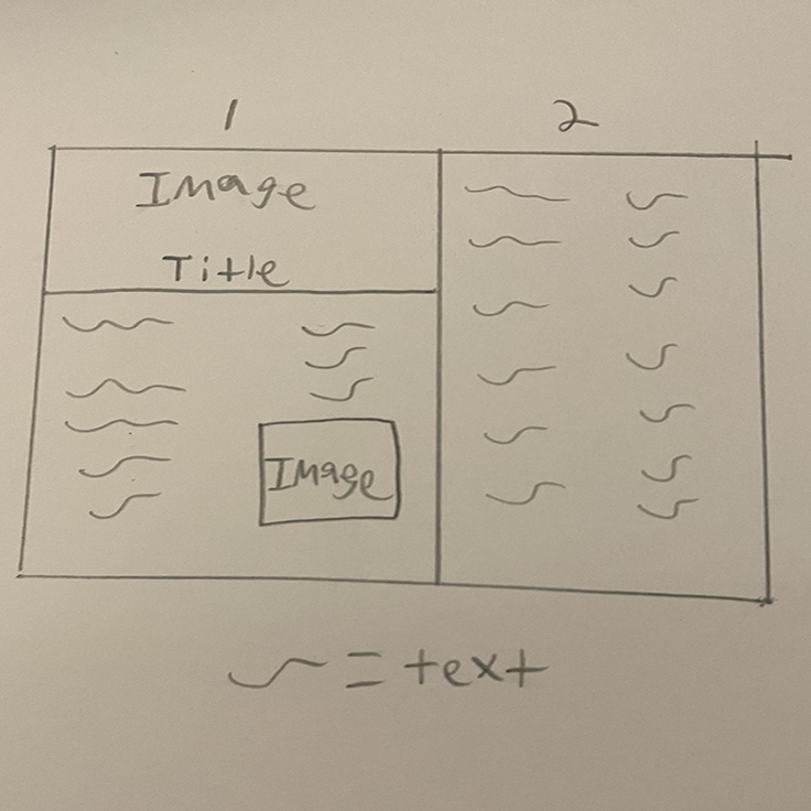
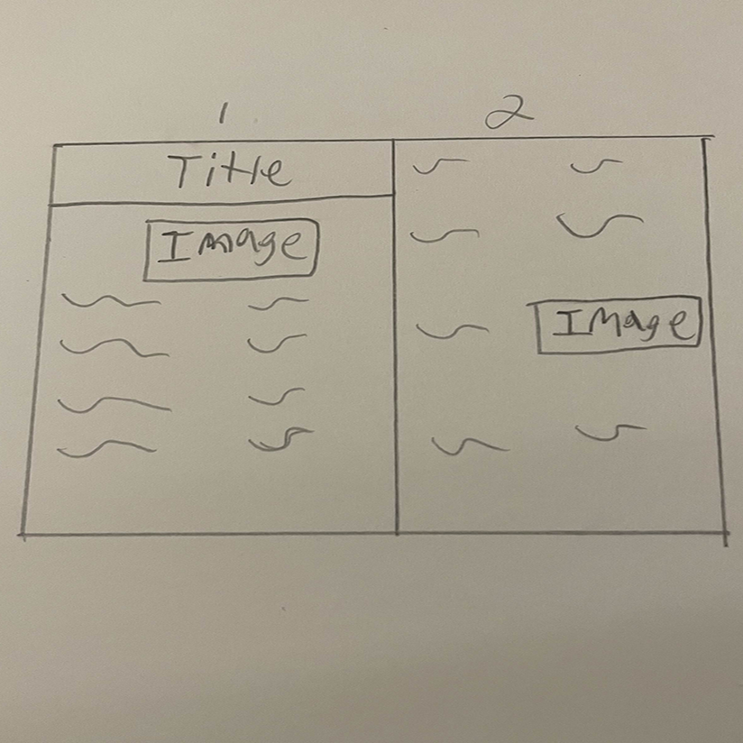
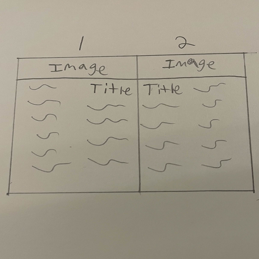
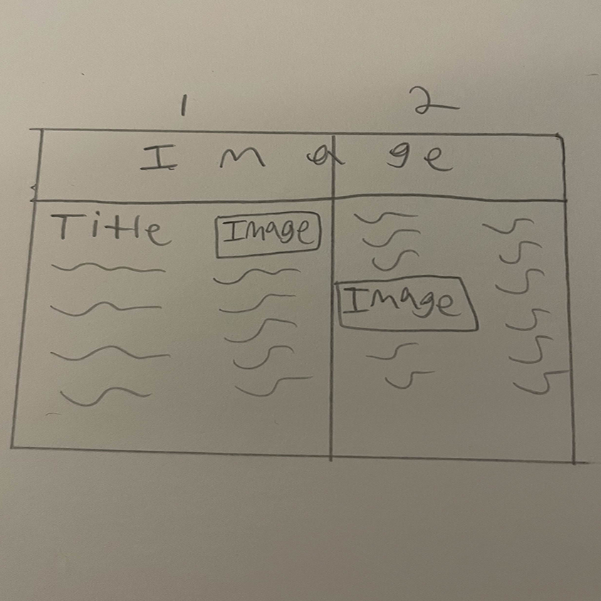
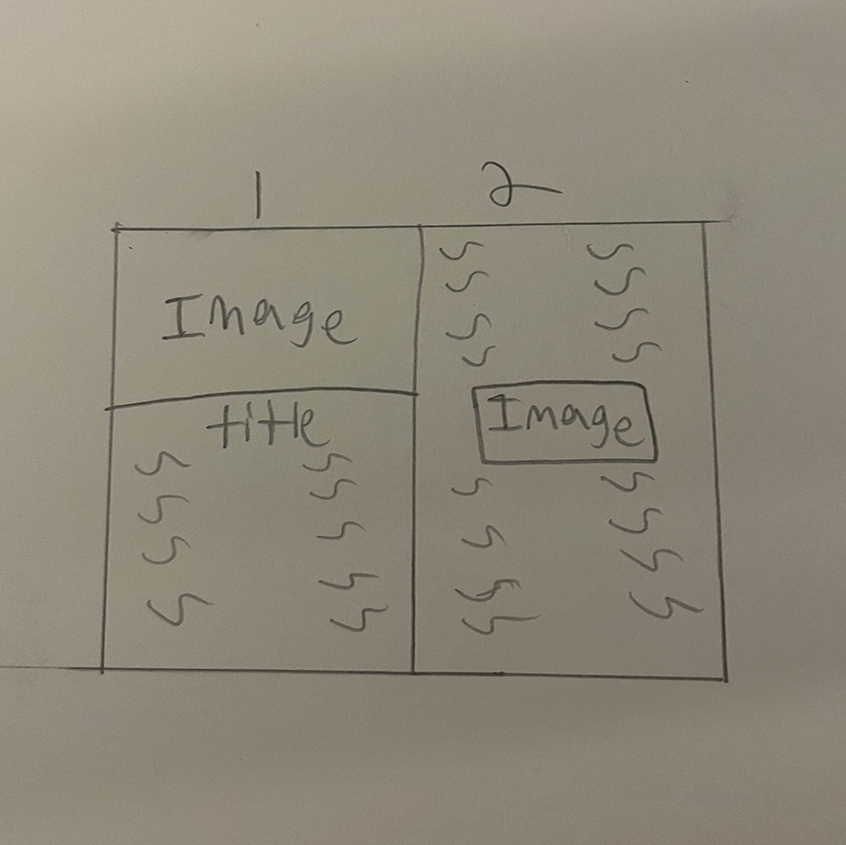
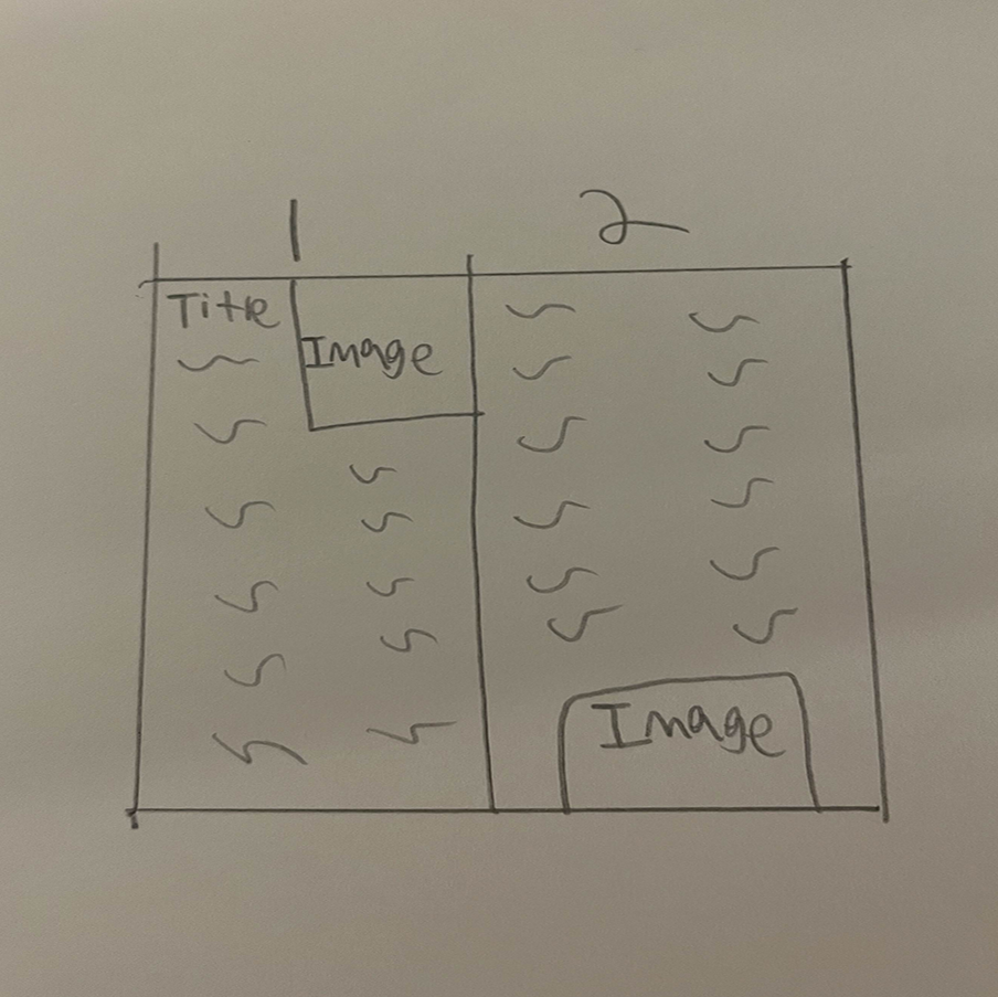
Sketches
Each sketch shown here shows various ways I could have laid out images and text. The sketches served as way to figure out what layout would work the best with how I envisioned the magazine pages.
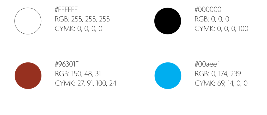
Colors
White was used against the first page’s image. Making that text easy to read.
Black was used for the type on both pages.
The red was used only as an outline for the box around the recipe on the second page.
The blue was used as the background color on the first page to contrast with the second page which just has a white background.
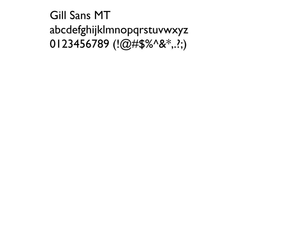
Typography
Gill Sans MT is the font used for all text.
Using italics for the “our continued series…”
Bold was used for the main introduction heading as well as some other text.
The regular typeface variant was used for all other text.
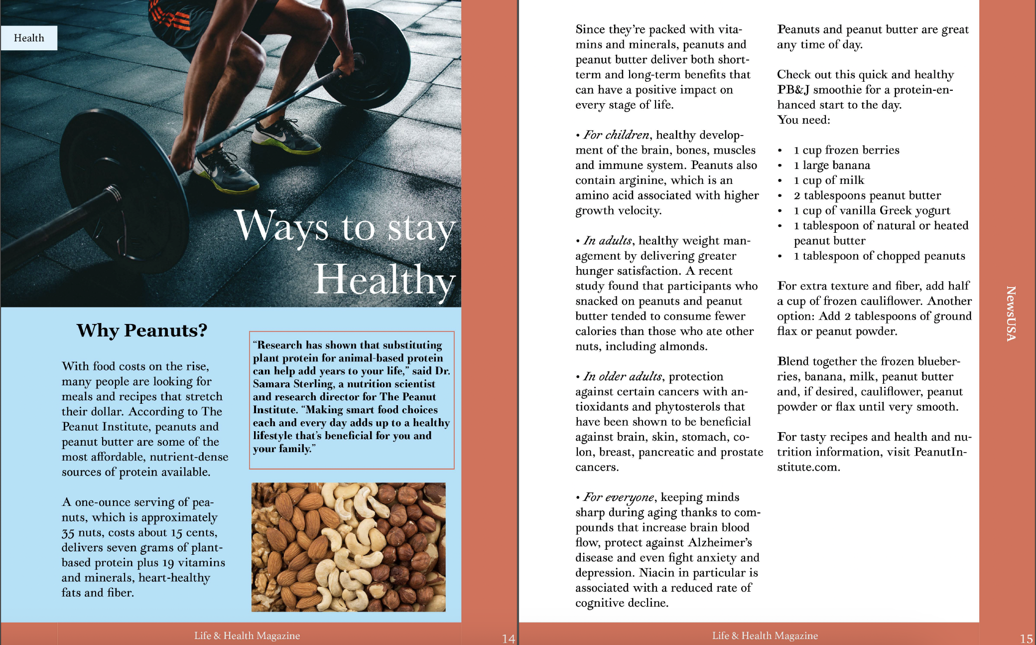
Digital Drafts
The first iteration of the magazine had issues with alignment, text alignment, hanging indents, and gutter spacing. While it was a decent start, there was plenty of room to improve the pages. Much more research was done after this initial draft.
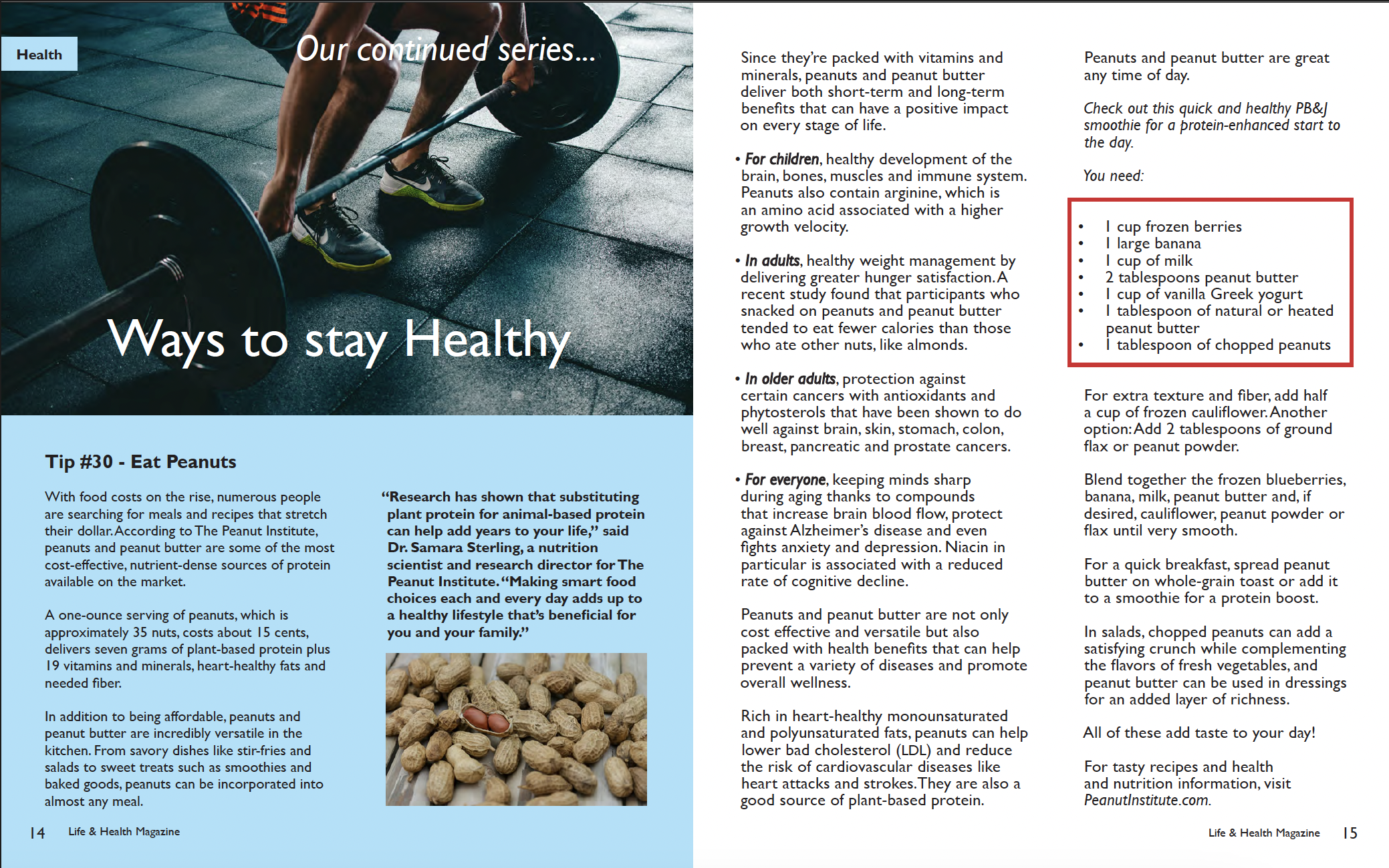
This iteration solves a few of the problems from the first iteration. The gutter was given more space, hanging indents were made, and more text was added to fill out the magazine. As well as removing the red borders of the magazine. A different font was also picked which would go on into the final magazine iteration. A magazine folio was also added at the bottom of both pages.
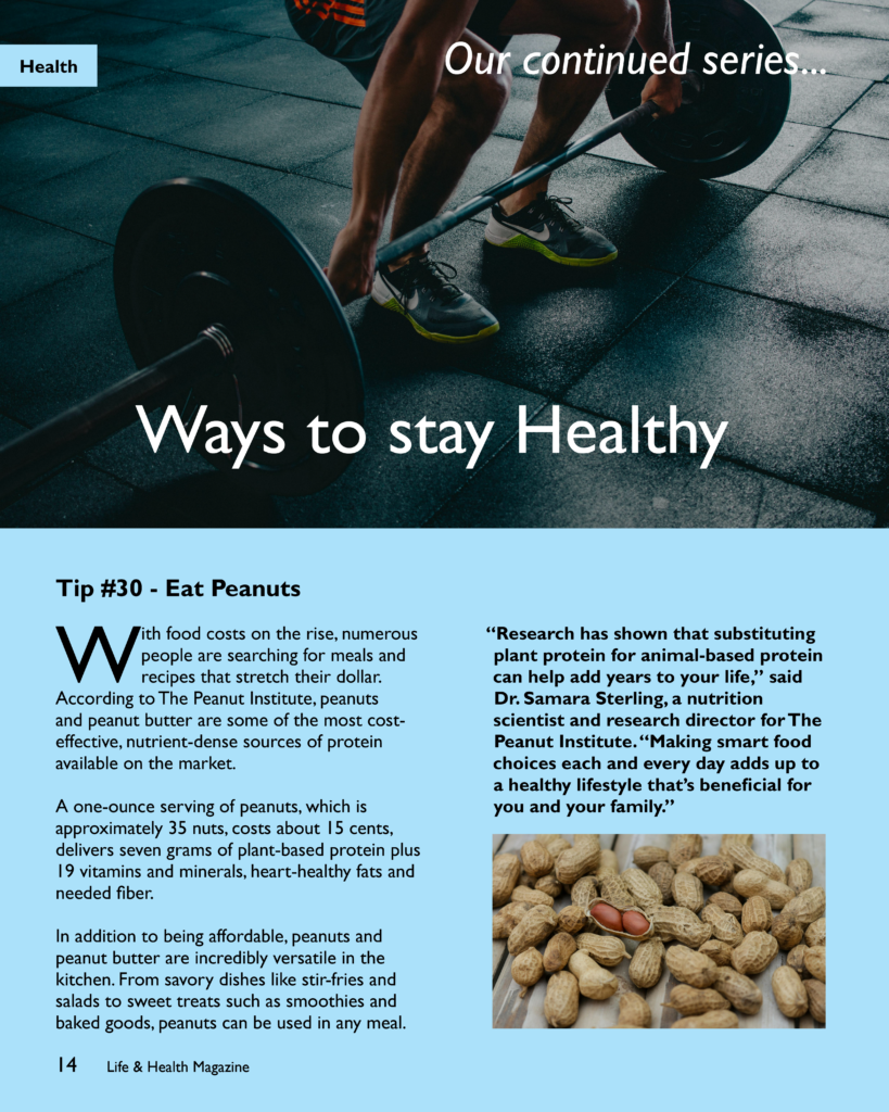
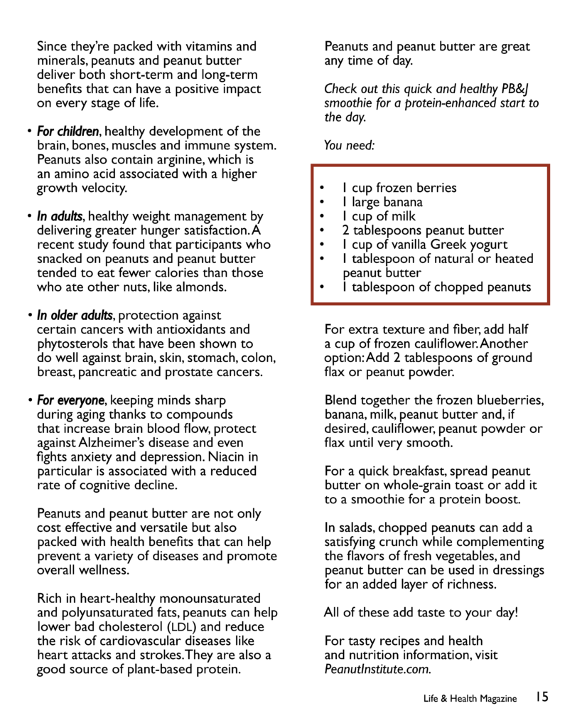
Final Magazine Spread
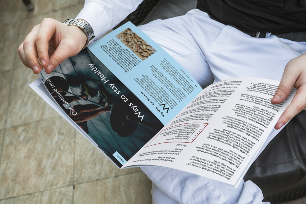
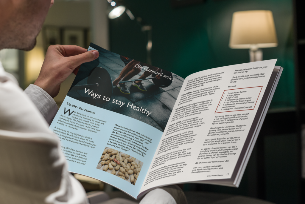
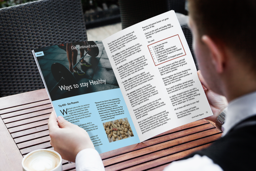
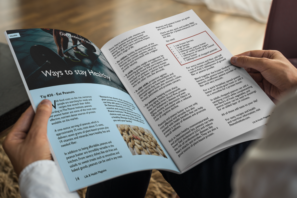
This is the final iteration of the magazine. A drop cap was added to the beginning of the article. Each problem that was recognized such as gutter spacing and text alignment was fixed. Along with improving the folio near the bottom of both pages. Some text was also moved around to fill out the magazine as needed.
Environmental Contact

