Book Design
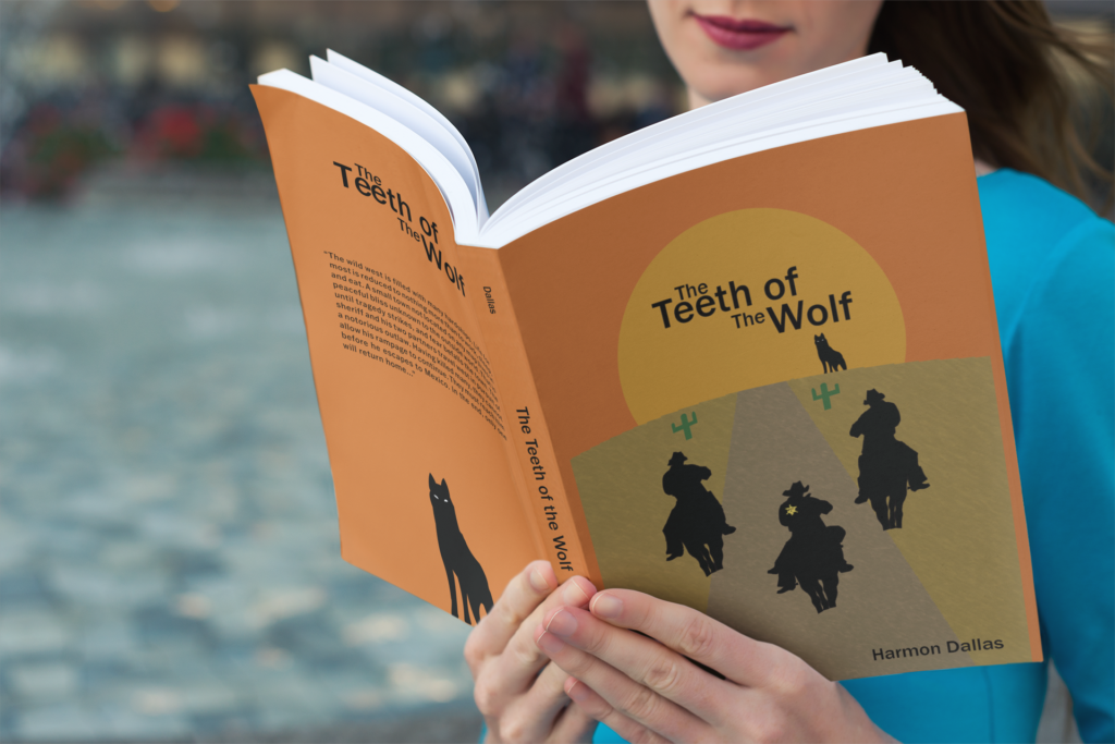
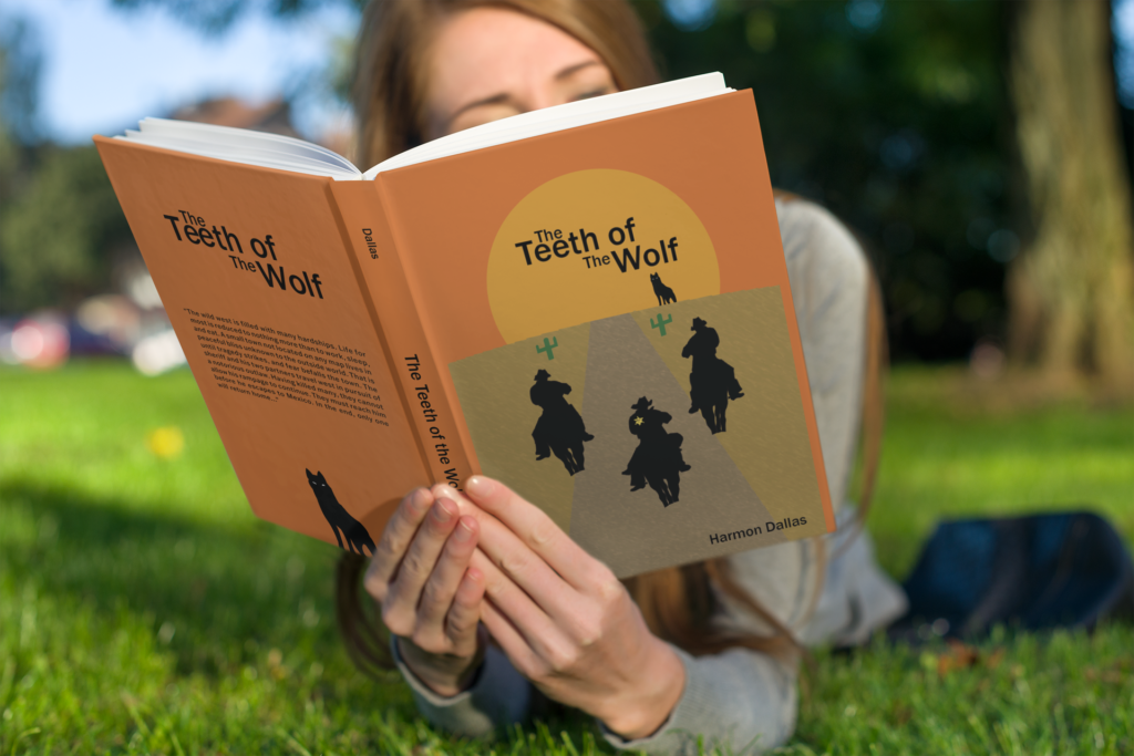
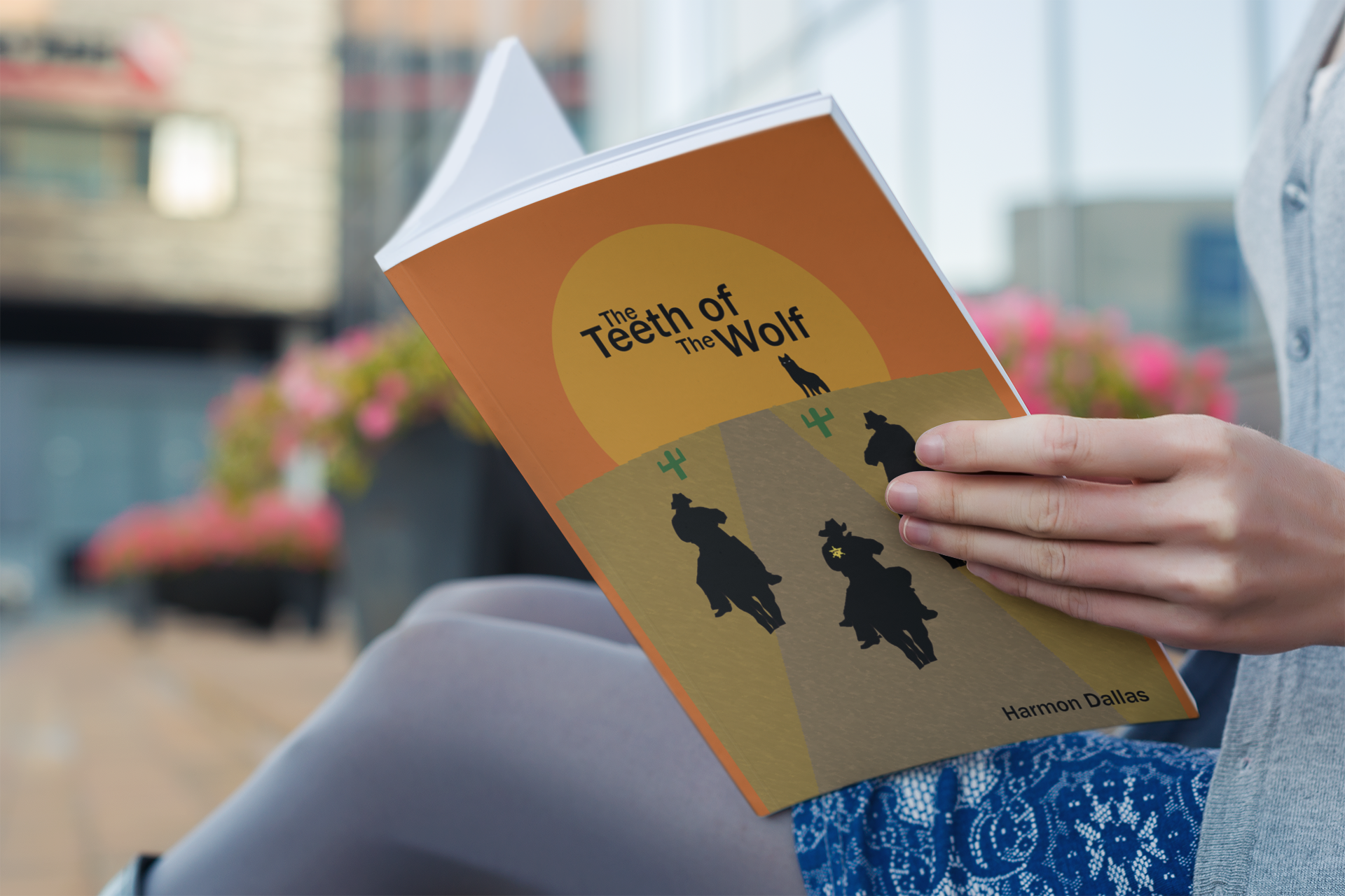
With “The Teeth of the Wolf” being the title, my intent in making the book cover was to reflect the title with darker colors and imagery.
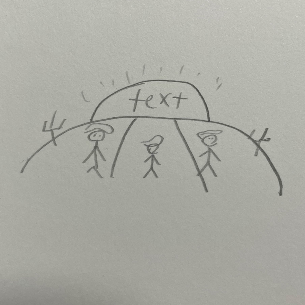
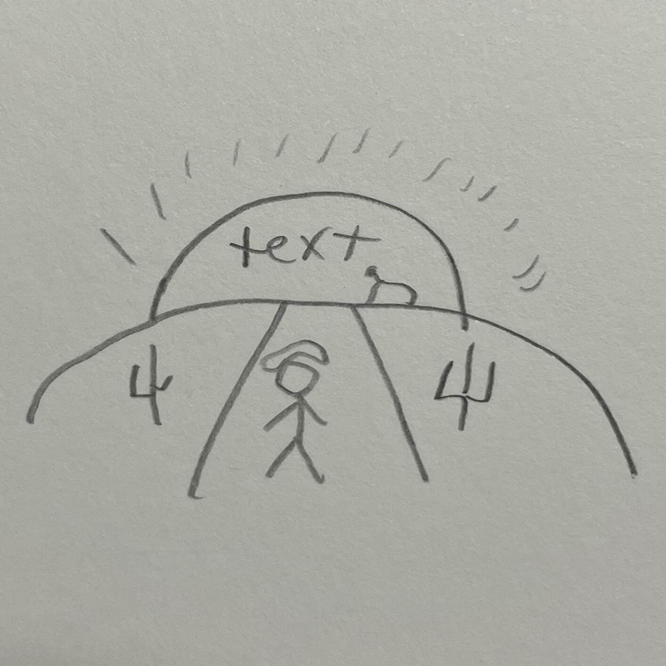
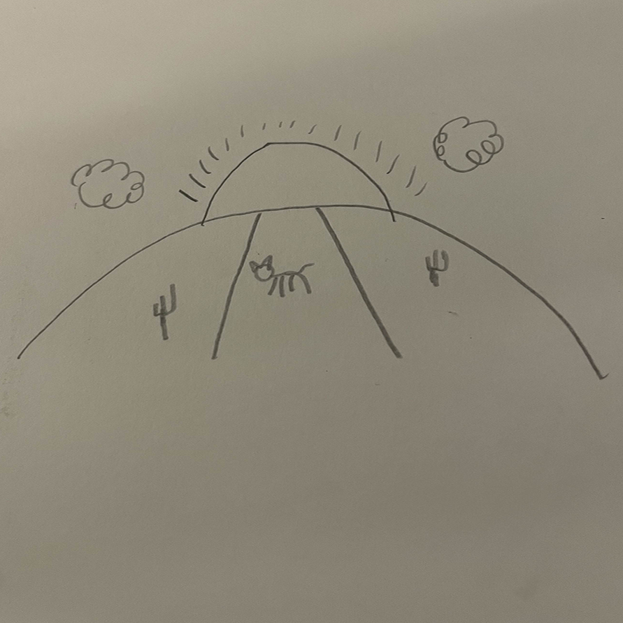
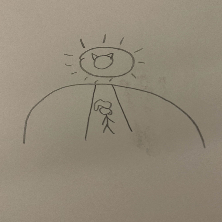
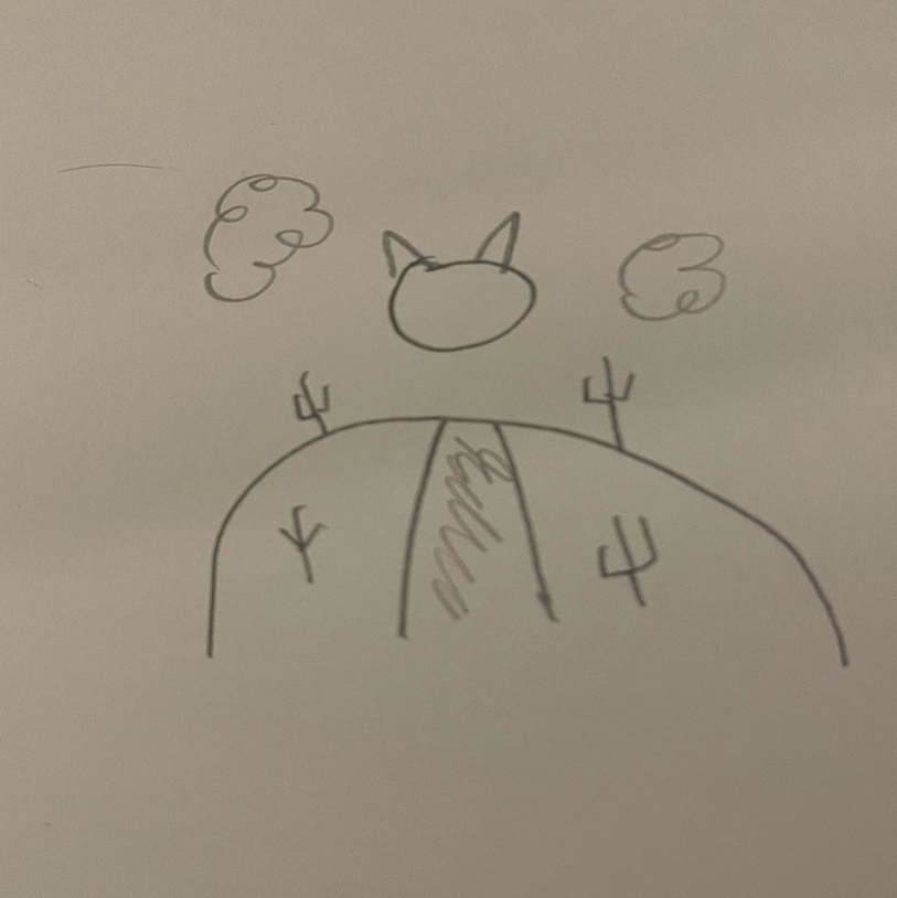
Sketches
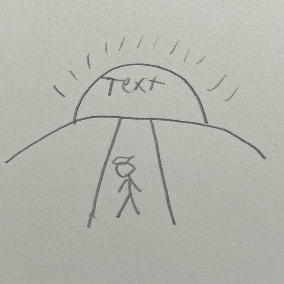
The first sketch worked as the start for my other sketches and the overall idea for how I wanted to present my book cover. The other two sketches add a little more detail with two more cowboys and cacti.
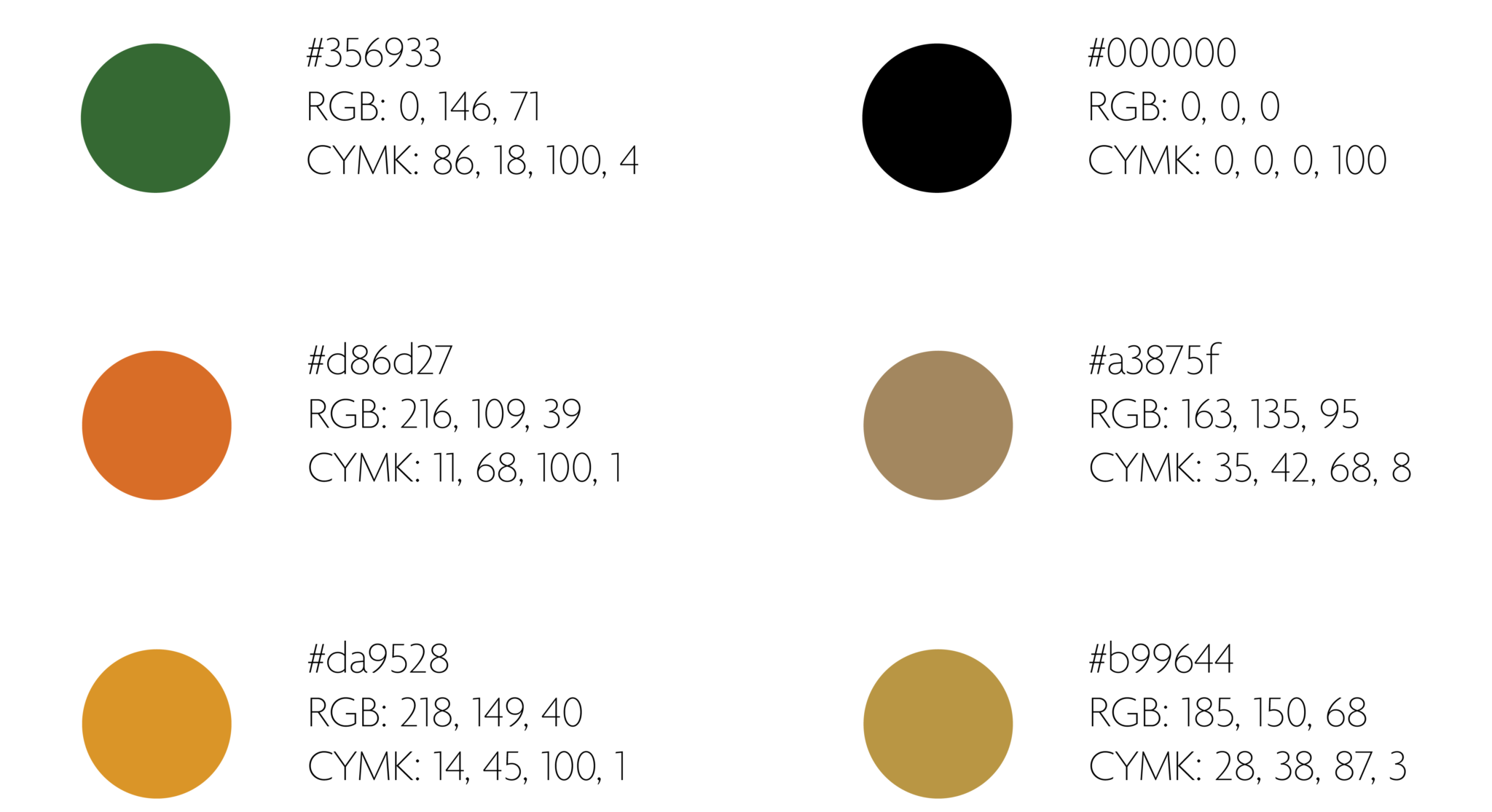
Colors
The colors used were purposely picked to be darker on the scale. Wanting to reflect the theme of the book’s title as it invokes a darker theme.

Typography
This is the only typeface used across the entire cover, spine, and back cover. Again, wanting to reflect on the book’s title and theme with the chosen typeface.
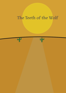
Digital Drafts
The first iteration of the book was essentially getting the basic layout that would be further developed later. As well as going with a placeholder font. Following my sketches out in terms of how I transitioned it digitally.
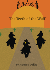
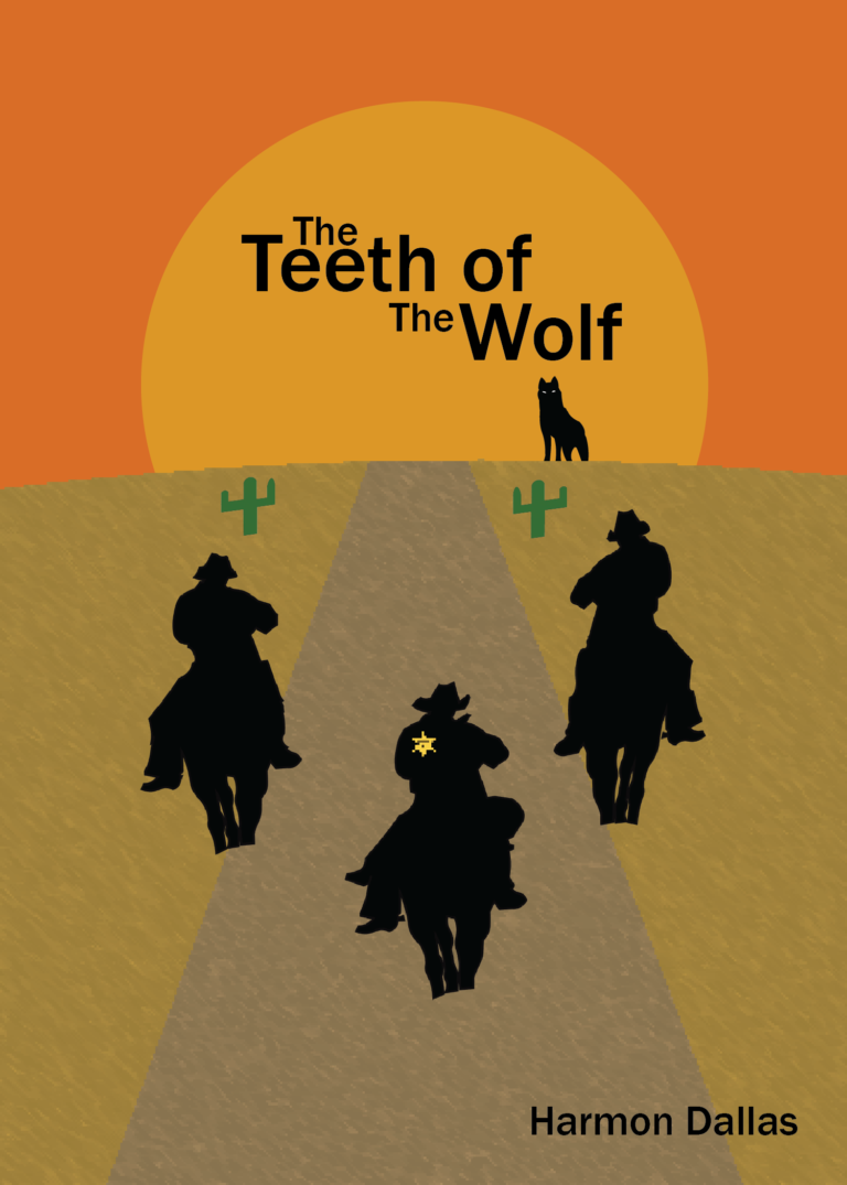
This iteration is from after every piece was put into place. The Sun, wolf, cowboys, cacti, etc. Giving the entire book a dark color scheme. Also putting the author’s name at the bottom of the cover. However, while more were set in stone, there was still plenty to improve upon. Such as a better typeface, differences in each cowboy, and the wolf.

This iteration was created and is close to the final product. Addressing everything that was wrong with the last iteration. The typeface changed to a more legible one, the wolf changed to be more like the cowboys. Moving the author’s name as well for print purposes. Still, however, there was a bit more to change before it would be fully complete.
Final Book Design
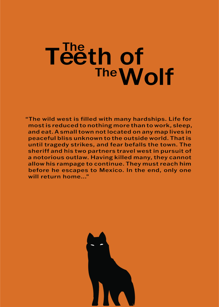
This is the final iteration of my book cover. The cover is center-aligned to show each part of the cover perfectly. This goes for each object on the cover and back cover to make everything more harmonious, excluding the spine. The typeface also changed to one that I believe reflects the overall book title more.

Environmental Contact


